Voi Hyvin Honey Website Design
Background and Strategy
Voi Hyvin is Finland's largest organic honey producer. The brand name, "Voi Hyvin," means "Feel Well" in Finnish. With the website and other branded materials, we wanted to convey the authentic story of this small family business and their passion for bees, honey, health and environmental sustainability.
Website Design
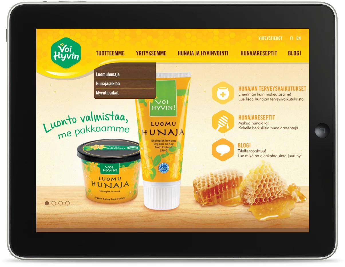
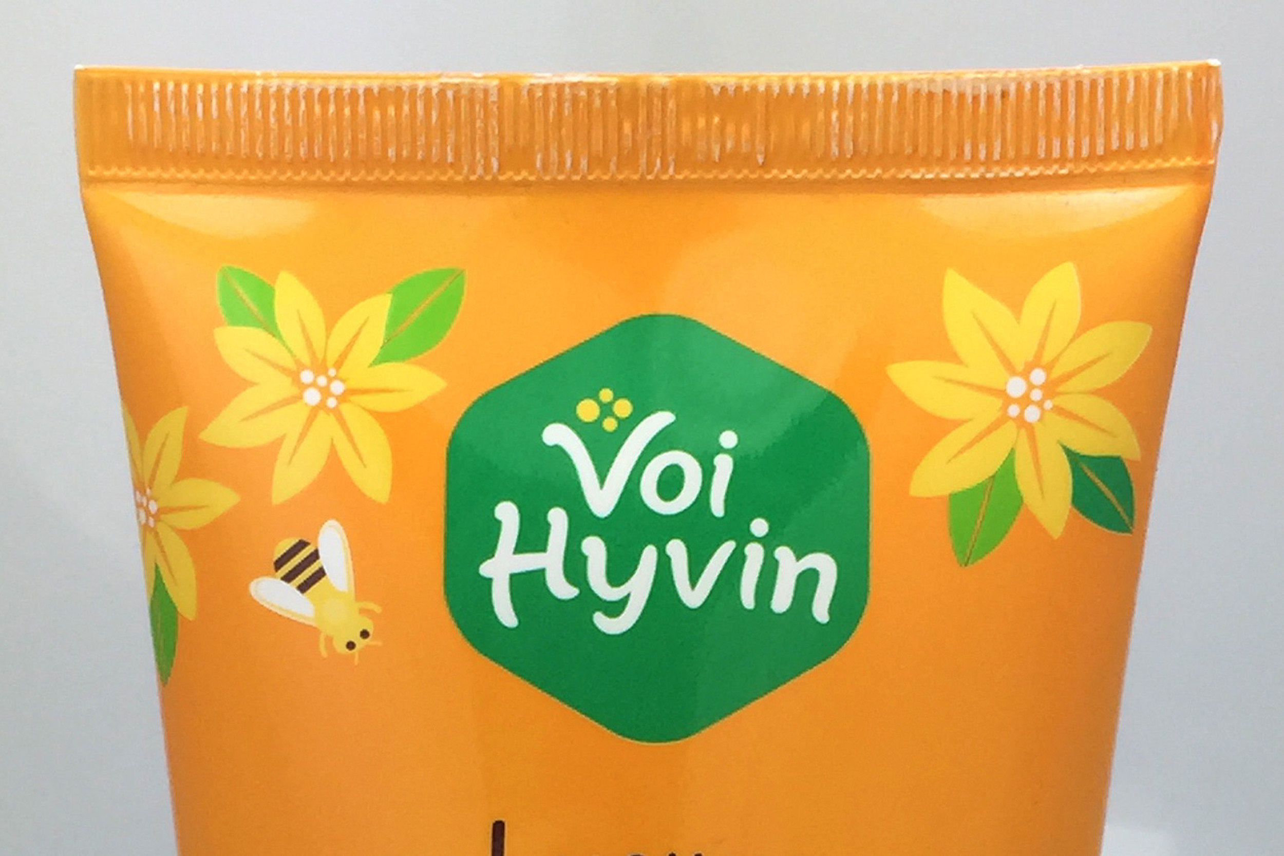
The website design builds on and evolves the brand's existing brand equity. We chose to maintain the honey package's yellow color and a green color for the logo crest, but visually updated and refined all visual elements in the brand, including the logo, on-package illustrations and the addition of realistic textures that connote a traditional Finnish farm with modern sensibility.
The honey dripping in the header navigation is a new brand identity indicator, used not only on the website but carried over onto the packaging design for the honey chocolate bars.
Total Client Deliverables
Voi Hyvin's website design was part of a larger brand update. In total, we delivered
- Logo redesign and updated visual identity
- Packaging design for Voi Hyvin Honey Chocolate Bars
- Packaging design for Voi Hyvin Honey Squeeze Tube
- Packaging design for Voi Hyvin Honey Paper Tub
- Custom product illustration
- Website design
- Point of purchase sale signage


